Tips for Choosing Calm Colors to Create a Serene Home
Creating a calm and inviting atmosphere in your home starts with the colors you choose. Colors have a powerful impact on mood and can influence how relaxed and comfortable you feel in a space. If you’re aiming for a serene environment, selecting calm colors is essential. In this post, we’ll share helpful tips to guide you through the process of choosing peaceful hues for your home.
Why Choose Calm Colors?
Calm colors are typically soft, muted, and easy on the eyes. They tend to evoke feelings of tranquility, balance, and comfort. Unlike bright or bold colors, calm tones don’t overwhelm the senses, making them perfect for spaces where relaxation is key—like bedrooms, living rooms, or reading nooks.
Popular Calm Color Families
Before diving into tips, it’s good to know which colors often create a calm vibe:
– Blues: Light blues and soft turquoise remind us of the sky and water, promoting feelings of peace.
– Greens: Soft green tones evoke nature and growth, which can be very soothing.
– Neutrals: Shades like beige, taupe, gray, and off-white provide a gentle, versatile backdrop.
– Lavenders and soft purples: These tend to feel calming yet add a touch of personality.
– Soft pinks and peach: Warm but gentle, these colors offer comfort without too much stimulation.
Tips for Choosing Calm Colors for Your Home
1. Start with the Purpose of the Room
Consider the function of the room you’re decorating. Bedrooms benefit from soft blues or greens, which can help lower heart rate and encourage sleep. Living rooms or family spaces may work well with warm neutrals or muted pastels, offering a cozy yet calm atmosphere.
2. Test Colors in Different Lighting
Color looks different depending on natural and artificial light. Paint sample patches on your walls and observe them at various times of the day before making a decision. Morning light is cooler, while evening light is warmer, which can change how a color feels.
3. Use the 60-30-10 Rule for Balance
To create a harmonious look, use calm colors in the right proportions: 60% dominant color (walls), 30% secondary color (furniture or curtains), and 10% accent color (decorative items). This helps prevent any single color from overpowering the space.
4. Mix Matte and Satin Finishes
Matte and satin finishes help maintain a soft appearance without glossy reflections that can be distracting. Matte paints also tend to absorb light softly, contributing to a calm ambience.
5. Don’t Be Afraid to Use Warm or Cool Tones
Some calm colors lean cool (like soft blue-gray), while others are warm (like sandy beige). Choose what feels most comforting to you and complements your home’s style and lighting. Mixing warm and cool tones thoughtfully can also add depth and interest.
6. Incorporate Natural Elements
Colors inspired by nature usually feel calming. Pair soft greens or browns with natural wood or plants to enhance the tranquil feeling. Textures like linen and cotton also contribute to a relaxed vibe.
7. Limit Bold Contrasts
Avoid high-contrast color combinations when aiming for calmness. Soft transitions between colors help maintain a peaceful appearance. If you want contrast, keep it subtle, such as pairing light gray walls with slightly darker gray furniture.
8. Pay Attention to Undertones
Colors often have undertones of other hues, which can affect the mood. For example, a beige with pink undertones feels warmer and cozier than one with gray undertones. Testing samples helps you pick undertones that suit your taste.
9. Use Color Psychology as a Guide
While personal preference is key, color psychology offers helpful insights. For instance, green is associated with balance and renewal, while blue can reduce stress and promote calmness. Using these ideas can help create spaces that also support your emotional well-being.
10. Add Pops of Color Carefully
Even in calm rooms, small accents like soft cushions, artwork, or rugs in gentle pastel or muted tones can add personality without disrupting the peaceful atmosphere.
Tips for Specific Rooms
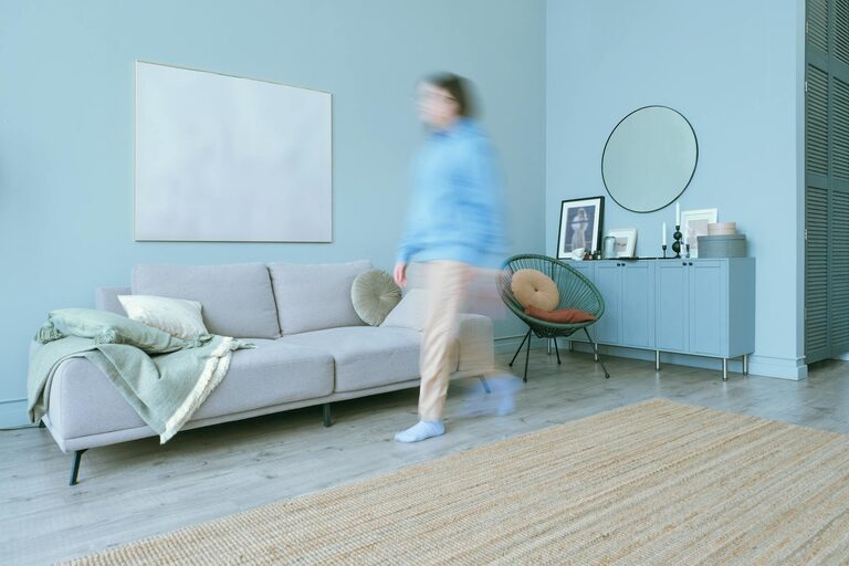
Living Room
Choose calm neutrals or soft blues for walls. Incorporate comfortable furniture with plush textures. Use layered lighting to create soft, inviting light throughout the day.
Bedroom
Focus on soft greens, blues, or lavender. Keep fabrics light and breathable, and consider blackout curtains in calming colors to help improve sleep quality.
Bathroom
Light blues, seafoam greens, or pale grays can give a spa-like feel. Choose moisture-resistant matte paints and add natural materials like bamboo or stone.
Home Office
Go for light neutral walls, combined with calming green or blue accents. Keep clutter minimal to maintain a serene workspace that enhances focus.
Final Thoughts
Choosing calm colors for your home is a wonderful way to create a soothing environment that supports relaxation and comfort. Remember to take your time testing colors, consider lighting, and think about the feelings you want each room to evoke. With these tips, you’ll be well-equipped to select a calming palette that makes your home a peaceful haven.
—
If you want to explore more about home colors and decorating ideas, check out our other posts and feel free to share your own favorite calm colors in the comments below!